5 key UX challenges in the home retail space
How do we make the buying process as easy as possible?
- How do we help users find the right product, every time?
- How do we get users to trust our service?
- If the user doesn’t want to buy immediately, how do we get them to do so later?
- How do we help them buy as easily as possible?
- And once they’ve bought, how we do we get them to come back again?
One of the biggest mistakes that retailers make is seeing their physical and digital channels as two completely different experiences. Our research shows that customers expect these channels to blend seamlessly with one another, and with pressure from big names in digital commerce like Amazon, these companies are under more pressure than ever to get this right.
Drawing from our experiences here at 26, we’ve uncovered 5 must-haves for the home retail space when it comes to delivering great user experience.
Challenge 1: Making sure the user can find the right product, every time
The biggest draw to online commerce is convenience. Users expect to find anything they want, wherever they are and expect to be able to quickly and accurately find the item they need. Product pages need to be succinct and accurate, aligning what the user is seeing on their screen and the expectation they have for what the product should be.
We recommend:
- Showing all options for colours and variants on product listing pages.
- Making sure a user can gauge the scale of a product. Every listing should have at least 1 ‘in scale’ image.
- Allowing users to add items to their ‘wish lists’ without committing to signing in or registering.
Who does it well?
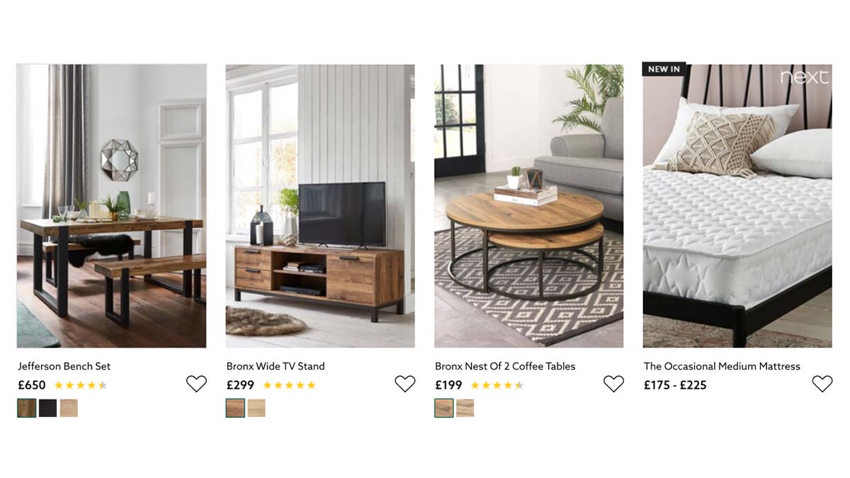
Next Home utilises in scale images and all colour variants on its homepage to give the user a perfect idea of what to expect:
As a retailer you need to make sure that the user knows their options immediately, especially if you can leverage your physical store.
Customers appreciate seamless integration between digital and physical, where they can pick an item online and find it with ease in the store or request the item to be available when the customer arrives. This prevents unnecessary and annoying trips to the store and allows them to instantly pick up items and avoid shipping fees.
We recommend:
- Leveraging your physical services online - making sure customers know exactly where to find the product in store.
- Show availability per store and give the option to deliver to a desired store online.
Who does it well?
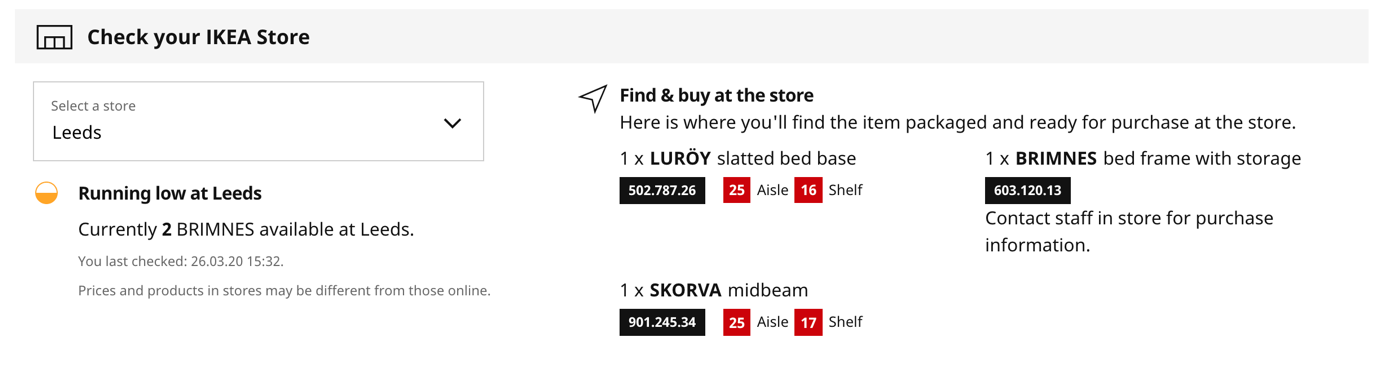
IKEA leverages it’s in-store purchases by telling the user precisely where to find the products once they visit the store:
Challenge 2: Getting users to trust your products and services
Following product information, reviews play a vital role in the decision-making process for customers online. Unfortunately, retailers’ processes to encourage customer reviews can be unnecessarily egregious, creating a missed opportunity to generate product reviews for free.
We recommend:
- Avoiding a complex review submission process
- Responding to negative reviews - this shows a great level of customer care and builds trust
- Showing an aggregated score system - stars are the most commonly understood and is the expectation from most modern website users
Coinciding with this, we often get asked where our clients should be using social proofing. Through neuromarketing studies, we can pinpoint exactly where users are experiencing an unconscious bias towards social cues. An example of this is where a retailer increases credibility by adding an indication that familiar people either like the content or are viewing a certain product at that exact moment in time.
We recommend:
- Adding links to other products through a ‘customers who like this product also like X product’
- If you are trying to get people to commit to a newsletter, indicate that there is already a large number of people subscribed
- Testing the use of different types of social proofing on key conversion points to measure unconscious bias
Who does it well?
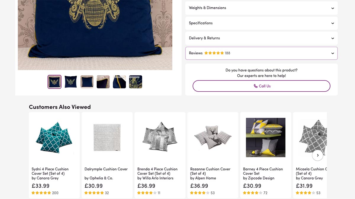
Wayfair.co.uk provides ratings and reviews for each product (expand in an accordion) plus products “Customers also viewed” and “Frequently bought together”.
There are also reviews for the company’s service which, although mostly excellent, they are sadly not taking the time to respond to negative ones.
Challenge 3: If the customer doesn’t want to buy immediately, how do we get them to do so later?
A missed and often big opportunity is the use of abandoned cart emails. Quite often, once a user has added their items to a basket and has initiated the buying process, they may opt out for a variety of reasons.
We recommend:
- A warm, friendly email reminder containing the cart items as an easy way back into the buying process
- Let the user know that you are holding the items for a limited amount of time, not only allowing the user to hop back in quickly, but also adding the ‘fear of missing out’
Who does it well?
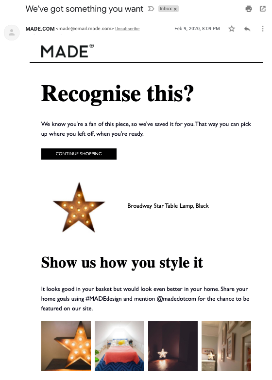
Made.com send a friendly little email (if you are subscribed) to remind you of things left in your basket. They also take the opportunity to showcase how others have styled it and encourage the recipient to do the same once purchased – “It looks good in your basket but it would look better in your home” - providing social proof and encouraging the purchase at the same time.
Challenge 4: How do we help customers buy as easily as possible?
Once the user has decided on a purchase from your product listings there are a few things to make their lives just that little bit easier. As well as making your options for viewing, delivery and collection crystal clear (as mentioned earlier), we recommend:
- Making sure your exit points are limited after the user reaches the cart - this will focus their attention on the checkout task at hand
- Offering guest checkout and don’t lock your services behind a sign-up process only (this doesn’t mean you can’t offer them the opportunity to sign up though)
- Offering flexible payment options where available
- Allowing the user to email their shopping bag to themselves or save their cart for later if they do not wish to purchase at that moment in time
- Using autofill for contact detail fields where possible and offer address lookups
Who does it well?
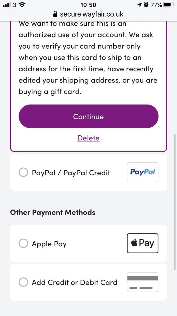
Wayfair remove all navigation during the checkout process to minimise the user becoming side-tracked. They provide guest checkout and an “email me a link” function for those who have forgotten their password. Apple Pay and Paypal are options for payment as well as a stored card.
Challenge 5: And once they’ve made a purchase, how we do we get them to come back again?
Generally, if a user is happy with their digital experience they are likely to return, especially if you offer loyalty points on purchases and keep them engaged after purchase.
One key area here is leveraging your social media and encouraging user generated content from advocates that educate your audience and provide a layer of customer loyalty through a following. Use your social media to drive relationships without being pushy, show offers and promotions and much like user generated reviews, make sure to monitor and respond to customer activity online to show that you are active and listening.
Another critical area is the ‘order returns’ part of your site. A user is around 60% more likely to engage with your brand in the future if their returns experience is a positive one.
We recommend:
- Providing complete tracking and delivery options on checkout. If you are using a third party like UPS, provide the return label on the site as well as through an email and in the post
- Directly promote in-store returns (if available) in the user interface during checkout
- Update order status and notify the user when anything changes to their order
Who does it well?
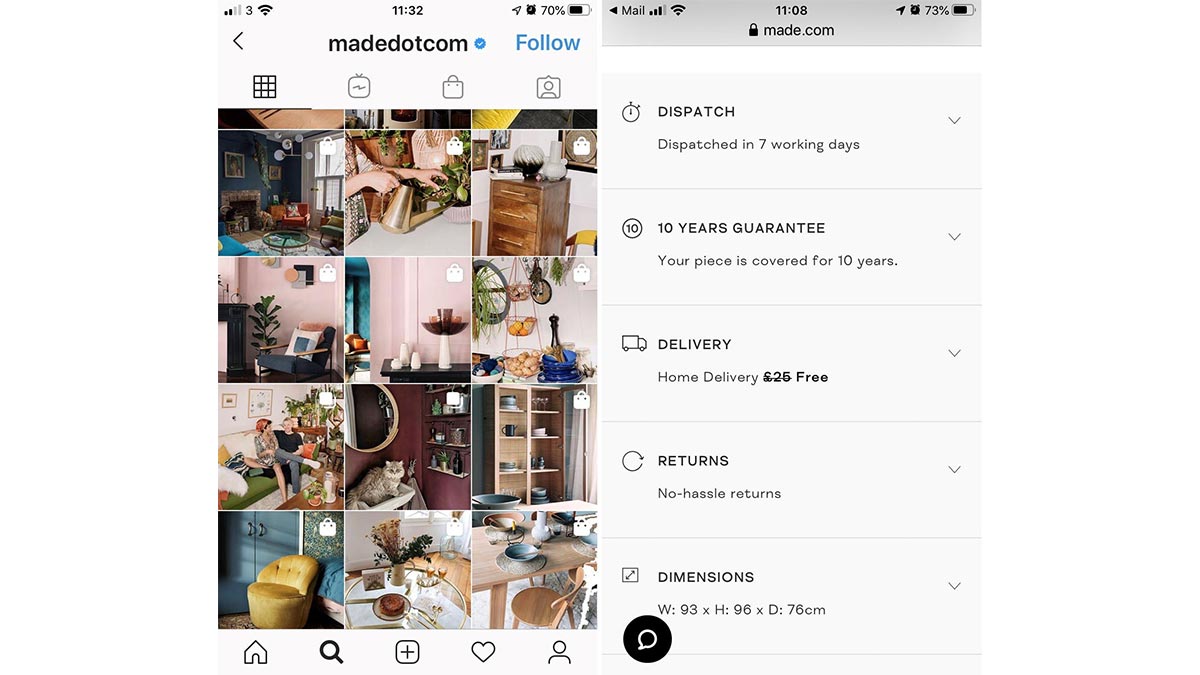
Made.com encourages users to post their styling ideas via Instagram (see Challenge 3 above!) as well as posting on the brand's Instagram from where you can also link to buy products in the pictures.
Delivery information and returns and refunds are also made very clear on product pages as well as being linked from the footer.
If you’re looking to optimise your user experience, we offer a range of services from user research and workshops, to usability audits and testing, including advanced neuromarketing techniques. Get in touch.
Our insights
Tap into our latest thinking to discover the newest trends, innovations, and opinions direct from our team.